Falling for eHarmony.com
I happened to find out about the new eHarmony.com design purely by accident. A single friend of mine was getting her daily virtual flirting fix when she noticed that some areas of the website had been redesigned. Luckily, she had her socks blown off by the new look and thought to send me some screen shots for a sneak peak.
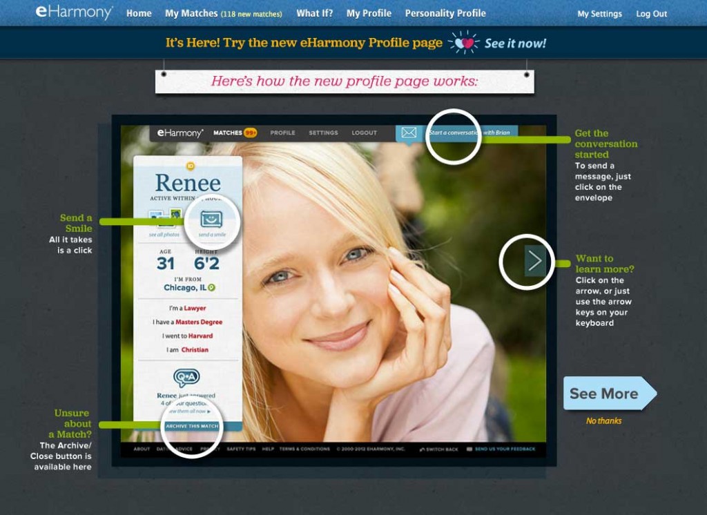
I was bowled over by the simple, clean layouts; full bleed photography and stunning use of typography. My eye was naturally drawn into the page and guided to all the key areas of information through the perfect use of visual hierarchy. Allowing profile pictures to fill the entire screen makes for an emotionally engaging experience. Let’s face it, first impressions are everything at this point of the dating game and eHarmony does a great job of eliminating any potential distractions and facilitating those awkward introductions.
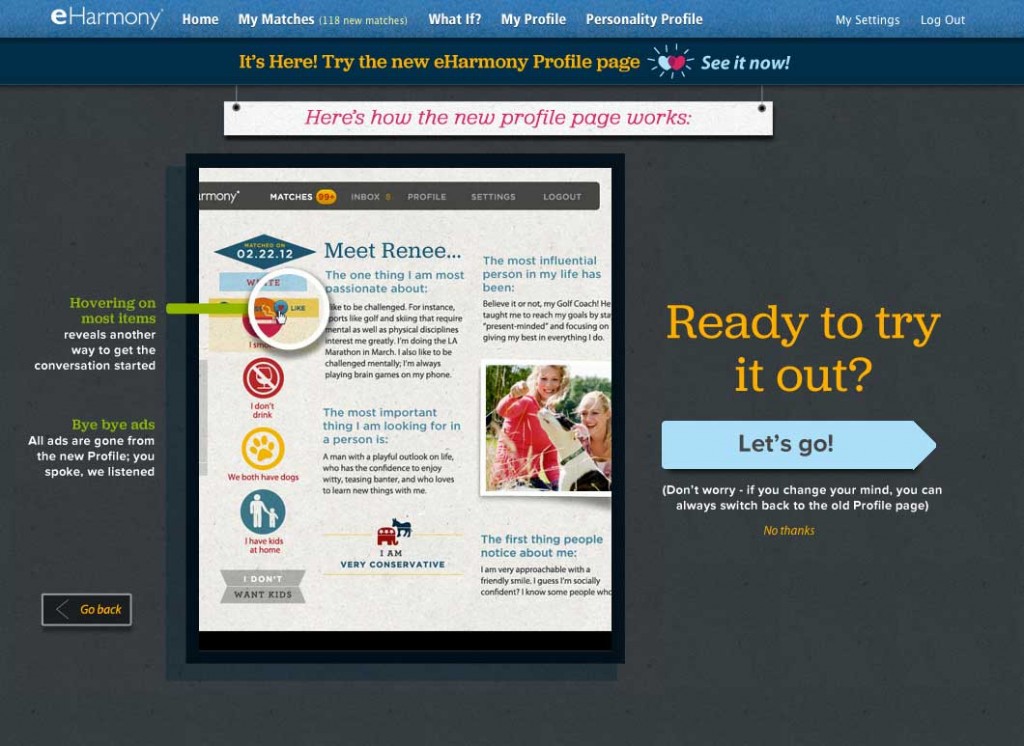
If I like what I see, I simply click the big arrow to the right of the pages and I get to see a little bit more each time, gradually building anticipation but, only if I initiate the conversation. Although I’ve been out of the dating scene for a long, long, long time, I feel that eHarmony really gets to the core of how we behave in this context and creates an experience that feels natural. By visually getting the all-important questions out of the way first by visually displaying information icons for smoking and drinking habits and whether you have children or want children. The pages are perfectly balanced with just the right visual treatment, placement and amount of information. This is what I call the ‘sweet spot’! The designers at eHarmony have done a fantastic job creating an elegant and engaging user experience but the real kudos should go towards the people who made this happen. It is tough strike a balance between great creative, business goals and technology but eHarmony have cracked it.
About the Author
 Christie currently works as a User Experience Researcher and has a history of consulting with award winning brands in the US and London such as Nike, Ogilvy and Adobe. She has a keen eye for good design and enjoys a good pair of shoes. She can be found on Twitter @BlondeOrange.