Back to Basics: Gestalt and Proximity
I had an ah-ha! moment today, one for which my instinct was to immediately chastise myself, and say “duh Lauren”. But then I took a second thought and reminded myself that while like most users I tend to blame myself when I can’t use software, often it’s a result of poor design and not my lack of observational or technical prowess. So here is the background to my moment.
Like many folks I’m an avid Gmail user. I love Gmail. One of my favorite newer features is the tabs that have been added to separate the mail from the Inbox to other tabs like Promotions, Social, Updates and Forums. There are many reasons I’m a fan of this and part of it is the way that the design supports human nature. The idea of sorting physical mail is natural and when you go to the mail box I bet most of you start flipping through your physical mail.. bill, ad, trash, oh a letter how exciting,… bill, ad, trash, bill, bill… etc. These piles are a natural way of understanding what we have received and organizing the information. Big thumbs up to the designer on incorporating this into the electronic design.
However this brings me to the point. When these tabs went into place some of the other features and functions were shifted to make room on the page. To my disappointment one of these items was the check box that appeared above all of the other check boxes to allow me to select all of my messages. So, I began the habit of individually selecting my emails and then deleting them all at once. I picked this habit up without consciously really thinking about it, more just a matter of perceived need, and it’s something I have been doing for quite a while now. However, lately it has really been bothering me as I’ve signed up for some extra things and the extra emails have been adding up to a lot of extra clicks. I just want to select all and delete.
Focusing on the boundaries of the main mail area, here is the “old design” of Gmail as of Nov 2011 (still pre tabs). While Google often shows a single line ad dividing the functions and the list, scrolling removes it, and the relationship between the individual check boxes for selection, and the select all check box at the top are clear and close in proximity and alignment. Easy to find and use.
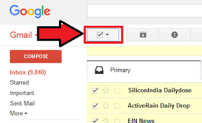
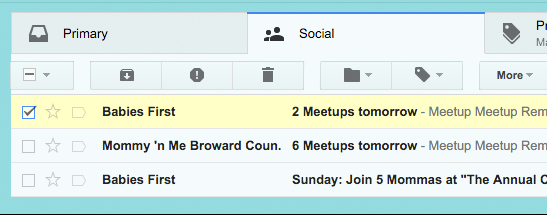
Now here is an image of what I currently see in the main mail boundary today. You’ll notice that compared to the image above where the mail and mail functions are in close proximity, now you see tabs just above the mail instead which represent the organized mail categories.
While some of you wise to the design may have picked up what I’ve chosen to omit in this screen shot, it goes very directly to my point. Where is the select all option? When we look at the screen, especially a screen shot or design comp it is easy to review the entire image and take in all of the nuances. However in reality when we are using software our eyes bounce around at a crazy rate taking in bits and pieces at time as we complete our tasks.
We look where we expect things to be, and we look based on the placement of related items. What we actually focus on at one moment in time with our visual fixations is roughly the size of 20×20 pixels. It’s much easier than you might imagine therefore to simply not see something on a screen that is roughly 1280×800 as your eye is bouncing around looking for something. I failed to see the select all check box because it wasn’t where I expected it to be, which would have been just above the individual row check boxes. Instead it has been moved above the tabs.
This goes back to basic design principles like the Gestalt grouping principles and proximity. The closer items are to each other the more likely they are to visually be perceived as a group and therefore related. You might say “Lauren, it’s pretty close, you should have seen it.” Well, maybe, but I didn’t. I’ve been passively looking for that silly box for probably over year.
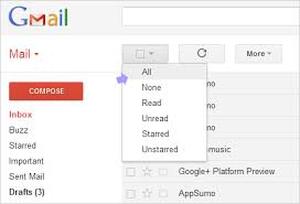
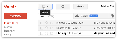
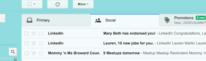
Now, I do believe there is another reason that I constantly seemed to miss it related to the way I go through my mail. My process is to start selecting items as I scan down the list… check, check, check… then I’ll often say to my self I don’t need any of these and look for the select all once I’ve started this process. So I’m looking to select everything after I have already checked a few of the emails. In this case our select all check box looks different:
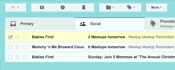
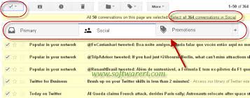
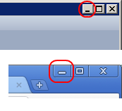
Now the action bar is not only a step removed in proximity, but the check box I’m looking for can’t be found because there simply isn’t a check box icon anymore. Now there is a box with a minus sign which doesn’t trigger any type of “select all” action to me. It’s an icon that I’m not familiar with in relation to the task at hand. If anything, it reminds me of a minimize icon used for closing windows or panels.
This brings about an entirely new issue of familiarity and standards that I wont get into here. However, the point that I would like to make is that even though the icon is unfamiliar, if it had been placed in better relation and proximity to the action it controls I most likely would have figured it out. See below of a mockup of how this might look with the proximity fixed. The relationship is much clearer.

A quick search of “gmail select all” in Google images reassures me that I am not alone, as this obviously has needed to be pointed out to many people.