Midwest UX 2012 Session Sketchnotes
I’m so pleased that I was able to attend Midwest UX this year in my hometown of Columbus Ohio, and I was thrilled that it was hosted at COSI. It was a great conference with a lot of local talent from Columbus, Michigan and surrounding areas. I started off the conference with a spectacular sketchnoting workshop by Veronica Erb, Binaebi Akah, and Charlene McBride. I enjoyed the workshop so much that I decided to try sketchnoting the entire conference. This post is the result of my efforts. I hope they are as enjoyable to read at as they were for me to create.
What is a sketchnote?
Before I begin with my sketchnotes it might help to describe the method. Sketchnotes are a form of visual note taking where the author creates notes in the form of text and doodles as a presentation is being given. To paraphrase an article from Core 77, it’s a from of rapid vizualization that forces you to pay closer attention to the content, while simultaniously vizualizing images that will capture the idea. According to Wikipedia, doodling like this can improve your recall of the content by up to 29% while helping you to pay attention and stay focused.
You can see some great sketchnotes at Core 77’s Sketchnote Channel, at Sketchnote Army, or in a book like Sketchnotes 2011 by Eva-Lotta Lamm
Midwest UX Sketchnotes
Let’s Sketchnote!

Click image to view full sketch.
This was a workshop by Veronica Erb, Binaebi Akah, and Charlene McBride. At the beginning of the workshop we watched a video called Step Outside Your Comfort Zone and Study Yourself Failing that we used to try our hand at sketchnoting for the first time. It was a really great video about learning new things by practicing until we can get to a point of auto-pilot or the “autonomous” stage. Then how to push beyond that to achieve greatness by not becoming complacent at this stage.
We then got lessons in organizing our page, trying to focus on the number of points for the talk and basic sketching tips and tricks.

Click image to view full sketch.
Once we were done learning some pointers we got to try a second video, unfortunately this was definitely a more complicated video and I had a little trouble with it. This was a TED talk by Manuel Lima about complexity. RSA Animate has done a fantastic job with a visual production of a similar talk that Lima did which puts my sketchnotes to shame, but I did find it fun that I used some of the same graphical representations that they did.
Designing for Social Innovation

Click image to view full sketch.
This workshop was originally titled Design Mobile Apps for Behavior Change and was presented by Haig Armen. It had some excellent exercises for example our group was tasked with making a mobile app for a hipster that involves nature. Having a somewhat of a target audience was nice, but not having a need was challenging. We came up with an organic farming app where local growers and local shoppers can connect with out a middle man like whole foods. We envisioned it having a Yelp like feature where you can rate farmers, upload pictures of crops, and share on social sites. The talk covered principles by many well know experts in the field like B.J. Fogg as well as discussing the parts of the Business Model Generation Canvas as shown at BusinessModelGeneration.com.
Keynote: Ubiquitous Information Architecture: A Framework for Cross-Channel Strategy

Click image to view full sketch.
The keynote was given by Peter Morville and was pretty much a solid summary of the workshop I attended by him at the IA Summit. He started by introducing the term intertwingled and discussing how we define Information Architecture. He then moved into cross-channel design, and how you can’t build on top of an existing foundation, you have to consider channels and your architecture together. This was followed by a couple examples of good cross-channel design and a note that what Steve Jobs was in charge of accomplishing made him the best IA ever. He wrapped up the talk with some tips and things to remember when building a cross-channel communication strategy.
A Brief History of New Media Art

Click image to view full sketch.
This was a fascinating talk by Matt Nish-Lapidus. Much of what he showed I had never seen as far as modern art. The presentation began with a brief rundown of how technology has impacted art for example with the photograph. Then explained that art isn’t about the artifact, it’s about time and space in which the art exists. He showed a couple examples of Fluxus art of the 60’s followed by Post/Transhumanism. He then moved further into the 80’s with art involving tv’s, music, static, and robots. Finally we took a quick peak into how technology is affecting design today with augmented reality.
Content Hoarding

Click image to view full sketch.
This was a fun 20 minute talk by Matthew Grocki. He started with a story about the clutter in his house and then related physical hoarding to digital hoarding. Just because it isn’t in the psychical space doesn’t mean we aren’t becoming seriously overwhelmed by content and hoarding it. In fact, digital hoarding could almost be considered worse. He recommends organizing and pruning content regularly.
Information Overload is Opportunity

Click image to view full sketch.
Karl Fast presented on this topic which was a nice follow up to Matthew Grocki’s presentation. The key takeaway for me was his comment that information is cheap, but understanding is expensive and that is where UX becomes valuable. He also had two great pictures of Steve Jobs that really brought the point home. In the first picture you see Jobs young, sitting cross legged in a serene open space that is a clean and crisp as the devices he would later design. But, this is not reality Fast points out then showing the second image of Job’s office later in life that appears to be in the basement of his home with cluttered bookshelves and stacks of stuff all over the floor.
Bring the Future to Life

Click image to view full sketch.
This talk was done by Colette Vardeman at Lextant and focused on a generative research model. By anchoring people in today first, and then getting them to think about the future and giving them a way to express their thoughts you can dig into the ideas they have. Then you just need to analyze and visualize it. Throughout the talk she showed a lot of examples of final designs by Lextant that I really enjoyed.
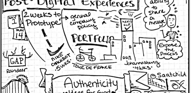
Keynote: Post Digital Experiences

Click image to view full sketch.
We had a day 2 keynote by Nathan Martin CEO of Deeplocal that I really enjoyed. It wasn’t specific to user experience as much as digital experience in marketing, but it was fascinating and very inspiring. I particularly respected the amount of skill he and his colleges had as well as their ability to prototype and deliver amazing experience in very short time frames. He showed a lot of videos of things his team has done, so I used those for my sketchnotes.
Upselling UX – Pixels to Strategy

Click image to view full sketch.
This was a 20 minute presentation by James Laing that talked about strategy. Strategy and design, he says, are both relative. First you have to understand what’s going on by asking a chain of why’s, then you can work to identify the weak links. With this information you can begin to help shape a stronger strategy for moving forward. He also talked about the need for building trust through demonstrated value.
Mapping the Experience

Click image to view full sketch.
This was a good talk by Chris Risdon that focused on user/customer touchpoints. To make a good experience or journey map you have to first to the customer research. Then focus on the touchpoints that express what the user is thinking, feeling and doing in a particular time and place across channels. It’s important to ensure stakeholders are involved in the process and that the final artifact compels action for change and improvement.
Designing for Disagreement

Click image to view full sketch.
This was an interesting talk by Boon Sheridan and my last sketchnote of the conference (hand cramp, I’m used to typing). I really enjoyed his approach of designing for disagreement in the sense that it was a cute way to say start early and iterate. You have to put your ideas on paper, and show them to people in order to get the feedback that is critical for shared understanding. He suggests showing the mock-up and saying “read through these ideas and tell me what you disagree with”. He also had a great suggestion of making workbooks for everyone that attends a review with copies of all of the designs being shown so that they can write their own notes in the respective areas throughout the meeting and you can keep them as a reference for the next round.