
Form over Function
In my attempt to order lunch this afternoon I was rendered stupid. One of those moments, where a website literally made me feel like an idiot. Then after a brief smack of my palm on my forehead I decided to post a reminder, that form should never replace function. This was my experience.
I did a quick Google search for the restaurant across the way. Just to set the context, here were my goals and expectations as a user:
- Review the menu.
- Look up their phone number
- Call and place a lunch order for pickup
I assumed this would be easy peasy. Until I opened the website. This is what I saw:

That is actually, all I saw. A beautiful image with some left and right arrows. Since the arrows caught my attention I clicked on them expecting to get into the main website content, and this is what I got next, another image:

The images are beautiful, and making me even more hungry, but I don’t seem to be getting to the content. So I’m clicking again and again wondering when the links will appear. These images have been designed to appear full screen no mater the resolution of your screen. They show from edge to edge and I don’t see a scroll bar (thanks to the way the Mac OS hides it). Then it occurs to me… what if I tried to scroll down anyway ?
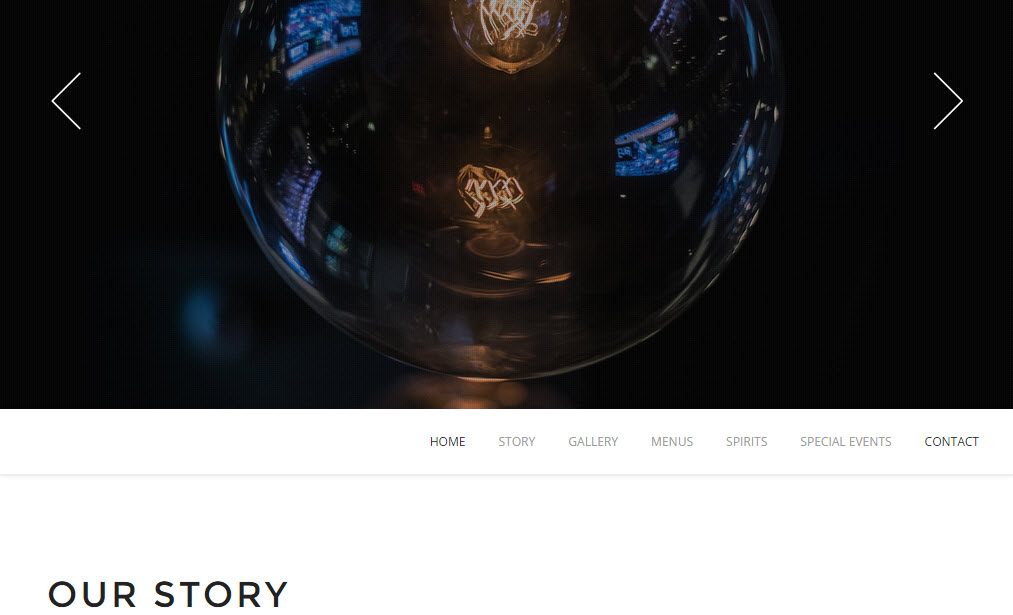
Ah Ha! [hand smacks forehead moment] Pardon the pun on the image but a light went off. After thinking I was crazy, I now feel like an idiot. But this isn’t my fault. The website should have never given me the opportunity to feel this way. While the design is beautiful, clean, simple and has great images the primary function is not to show off photography. This is a restaurant’s website and in this way it failed me. The primary navigation is only accessible by scrolling down from the main image, and it stays that way on every single page. Click… scroll down, click… scroll down. Additionally, since I’m on a Mac there is no indication that scrolling down is even necessary. Yet, the designer has encouraged with large white arrows that the user scrolls left and right through this gallery.
Now that I have figured this website out, I clicked on the menu and picked a salad, closed the menu and clicked on Contact. At this point I am expecting to see an address, and phone so I could call and order. Instead this is what I saw:
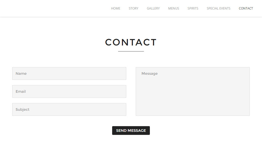
Again, there is no indication that there may be more information. The page has been designed to appear full screen with no peaks or hints at additional content. Clean and simple yes. But I don’t have a lot of confidence that sending an email with my order will result in a quick turn around time. Thankfully this time I had learned my lesson and tried to scroll down. Sure enough at the bottom of the page was a reservations number that I was able to use to order.
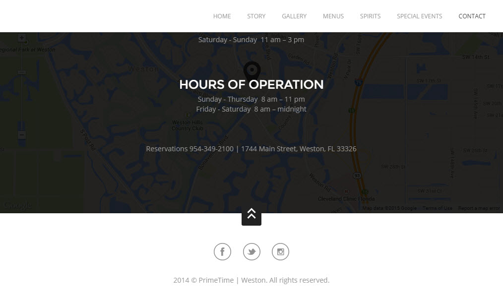
In hindsight when taking screen shots to post this I did also notice the number at the bottom of their menu… but it was also just perfectly hidden that I never saw it first time around.
This is a very simple example, and should have been an invisible experience. Unfortunately what should have taken me a couple minutes and made me feel successful, took more than double the normal time and lead to a lot of frustration with me feeling stupid. I hope this serves as a subtle reminder in this day of “make it look simple”. That there is more to a website than simple, clean, and pretty, It also has to work. Most importantly, simple is hard. It cannot be accomplished simply by removing, but must be a detailed analysis of the most important information to show.