Designing Deliverables – The UX of Communication
Too often I will see a report or set of recommendations for the user experience of something that in and of itself is not usable. This couldn’t be a more ironic and sad thing. We are the people who make things better, so our reports and recommendations should by far be the most well designed, easy to read, scan, and consume documents out there.
What qualifies as a usable document? I consider many criteria. Of course any document has some basic requirements.
For example:
- The user should know what page they are on, and how many pages there are.
- The reader should know the title and subject of the document they are reading.
- Near the beginning of the document, the take-away should be summarized for the reader.
- Sections should be clearly distinguishable from each other, and clearly titled based on their purpose.
- Where possible images should be used instead of trying to describe something that is visual.
- Footnotes and captions should provide supplementary information.
- Etc..
So what takes a bland and dry document to the next level? Engagement, delight, aesthetics, visual priority, chunking, grouping, call-outs and so on. This is where UX documents should transcend to the next level of usefulness. Examples are not easy to find, for a variety of reasons. One being that these well designed documents are rare, and the other that often they are confidential to the company they were created for.
The guys at EightShapes have done an excellent job promoting good documentation and even provide a free template library to get you started. Their co-founder Dan Brown also has a great book on Communicating Design.
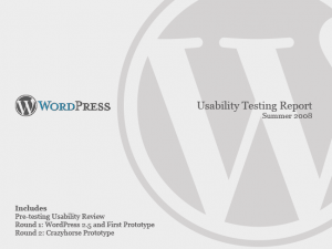
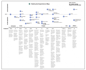
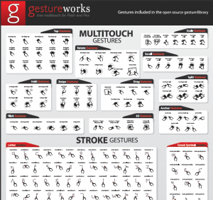
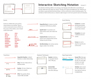
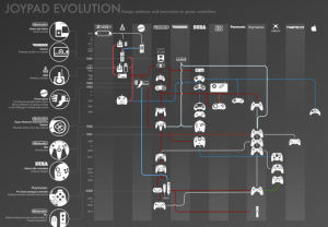
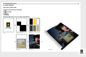
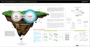
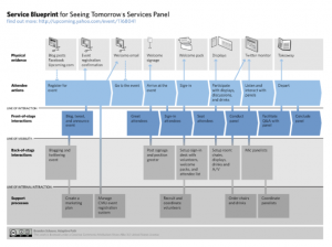
I have done some scouring for you and below are a few documents that I felt took MS Word + a theme and some styles to the next level by considering the user experience of the reader. They are not all perfect, but they are a start… I would love to see any additional examples that you find!

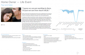
Another great example of a well designed document: http://static.bbci.co.uk/gel/0.2.14/downloads/GEL_web_styleguide.pdf