The Value of Intuitive Interfaces
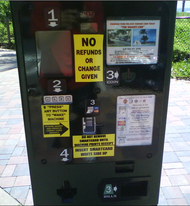
Never underestimate the value of an intuitive interface especially when designing for the general public. Nothing can be made too easy, but it can definitly be too hard. Below is a picture that was sent to me of a pay to park meter in Hollywood, Florida. Take a few seconds and really look at the instructions. What do you think you have to do first? What about second and Third?
According to a local resident, you start by first pushing any of the four buttons located under the #2, because you have to “wake” the machine up. Next you can put in dollars or coins (the #3 Coin or #3 Bills). To put in a bill, you place the bill in the slot, but a the little light above the slot must be green before it will take the bill. Therefore you may need to hold the bill there until the light changes, then it will take your bill. As you put money in, the time you have paid for will update on screen #1. When finished you must press the check mark below #2 to confirm and print your receipt, which comes out below #4.
Meter in Hollywood Florida
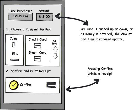
What happened to the basic meters? Where each spot would have a meter that took coins. For every coin you add the time on the meter increases. Now it seems that feature creep has stepped in and made a mess of things. So what has changed really? Now you can add dollar bills, pay with credit card, or smart card, and get a receipt. And I’m sure there are some other benefits in the back end such as metrics on spot usage, and data on when the lot fills up etc, but those things are transparent. So what happened to make these parking meters so confusing? Below is a quick sketch I did of a simpler design. How would you redesign this meter?
Possible Redesign


They can add these to the counter-intuitive directions on ATM’s – where the screen shows you to inserts checks one way, but the machine shows the reverse – and only one works. I think you should sell your new design to the city -umm, but would they care?
I had a similar issue with one of these machines late at night. There was no light to help you read the cryptic messages on the front of the machine and once i finally solved the payment puzzle i went on my merry way. Later to find out that there was a sign, in a different area of the parking lot that states that the machines only take time to 2am, when everything around closes at 4am. Why couldn’t the machine have warned me of this?
To add to your redesign, i might put the time selector on top, this way i can select the time i’d like to stay till, then move on to payment and confirmation. This way i’m not going through the repetition of looking at the coin/dollar slot then back up to the time and back down again to put more money in.
Cheryl,
I agree, while the idea of check readers is very cool, some of the individual banks have done a poor job implementing it. I do wonder if the city puts any though into the ease of use of their public meters. Maybe I will ask them…
Doug,
Interesting idea on the time selector. I put it there originally because with a credit card you have to choose an amount, but with coins and dollars what ever you give the machine is how much time you will have, like the old meters. Very interesting point though, the design definitely would require testing and iteration.