Annoying Interactions at Target.com
I had an annoying experience at Target.com today, enough so that it inspired me to write a post about it. To be clear, I love Target and shop there all the time. However, the website I think could still use a little work. The goal of the post is to remind readers the importance of getting out of your user’s way. To give you just the right amount of back story to my experience, I have provided a my general persona, goal and task for using the Target.com website.
Persona:
- Name: Lauren
- Occupation: Technology
- Computer Skills: Advanced
- Quote: “I want to get what I need, and get on with my day.”
- Summary: Lauren often uses websites such as target.com and amazon.com to do product research before making a buying decision. She will browse the site using both the search and the faceted navigation. She likes to look at the details of the product and read the product reviews, and will often look at many similar products. Because she often multi-tasks, or has a short period of time to research she likes to save her preferred product for later reference.
Goal:
Figure out if it is worth it to upgrade from my mountain bike, to a road or hybrid bike that has 28″ tires, and if so what bike to buy.
Task:
Review the bikes available on Target.com, and pick your favorites for possible purchase.
My Experience
I opened target.com on my iPad, deciding to do this search at the last minute while getting ready for work. I typed “bikes” into the search, then clicked on “Women’s Bikes” in the faceted navigation. Seeing 75 results, I decided to narrow my search by then clicking “Road Bikes” in the faceted navigation. I then noticed a men’s bike in the result set, and realized the search was not building, but instead each click to the faceted navigation was it’s own individual search.
I then scanned the navigation for wheel size which showed: 10″ -12″, 16″, 20″, 24″, and 26″. They did not have 28″ even though I can tell from the eighth product in the result set they bikes with 28″ tires.
Next, I backed up so that I was in “Women’s Bikes” again. I see that currently there are three pages of results, but there is also an option for “View All”, so I click that to avoid 3 pages of scrolling.
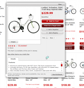
I then started scrolling down the list and scanning bike descriptions and prices. The fifth product a “Women’s GMC Denali Bike” looks interesting to me, so I click the picture of the bike for more details. Even though I have been on the site before, I am momentarily surprised and disappointed by the pop-up Quick Info panel. I scan it quickly, but as expected it doesn’t show much more information than the product gallery itself, so I scan the panel for a way to see more details.
My eye’s settle on the big “+ Add to Cart” button near the top right side, and then focus slowly on the options around it. I become frustrated looking for something that says “More Details” then a few moments later notice a little gray button on a gray background tucked on its own in the bottom right corner that says “View Full Details”.
I click the button, happy to that I have found a way to the main product page. I scan for a bit, then move the mouse to the product picture to click on it for a bigger view, however I quickly realize you cannot click the picture, instead you can only hover over it which provides a magnified view where the price used to be. Unfortunately, this magnified view is hardly any larger than the product picture itself, so I give up on seeing a larger view.
I scroll down the page, review the details and see the wheel height is not what I was looking for, but there seems to be good reviews for the bike with three people rating it five stars.
I decide I want to check out a few more bikes, so I click the back button to return to my search. I was surprised that when the results page loaded the “Quick Info” panel was still open on top of the result set. I closed the panel.
I then scrolled down and spotted a bike description that caught my eye “Schwinn Women’s Gateway City Bike – 28” “. I click the bike picture, and not the “Quick Info” hoping this time to go straight to the details page. I’m annoyed to see the Quick Info panel again, and click the “View Full Details” button to get past it.
I decide this isn’t the bike for me, as it looks more like a cruiser, than a bike I could do beginner races with. So I click the back button again to return to the search results. I am annoyed to see the “Quick Info” panel still open again, and close it.
I then see the “Ladies’ Schwinn 700C Trail Way Hybrid Bike”, because of research the previous day on other sites, I know that 700C has to do with a rim, that can accommodate 28″ tires, so I click on it. Annoyed at the “Quick Info” panel, that I can’t seem to avoid, I quickly click to see more details.
I try to click on the picture again, disappointed to be reminded you can’t really zoom in. Then scroll down to view the details and reviews. I’m initially annoyed that this particular bike doesn’t seem to have tire size listed in the details. Then notice a “more” link. I click it and see the wheel height is 28″ which makes me happy that my research paid off, but annoyed that the description couldn’t just tell me that upfront.
I read the reviews, and decide this bike is a solid option with great reviews. I decide I want to essentially save this page for later, so I scroll up looking for something similar to Amazon’s “Add to Wish List”. Unfortunately I don’t see anyway to save it, aside from what appears to be Target Registry’s, so I click the back button to return to the product result set, hoping to find a compare feature I can use to compare this to any other bikes I find.
I click to close the “Quick Info” panel that is still open and scan the page for a compare feature. I’m disappointed to see that no such feature appears to exist. I click on the bike I like again, and scan the “Quick Info” to see if it has an option to save that maybe the page didn’t. I don’t see anything that seems to be what I’m looking for, but I’m starting to wonder if “+ Add to TargetList” is there fancy way of naming a wishlist.
I decide to click on “+ Add to TargetList”. I notice a email and password form to sign in, then a bit lower, and option to create a Target.com Account. I’m hesitant, as I really don’t want to receive a bunch of junk email from target, or have to give them my information just to temporarily save my search, but I decide to just go ahead and do it as I’m nearly late for work now.
I click “I want to create a Target.com Account”. A form opens and I enter my name, my email twice, and my password twice, then un-check the option that allows them to spam my email. I leave the option on “Yes” that I am 13 or older, and click “Submit” hoping that my bike will now be added to a wish list associated with my account.
I am presented with yet another panel that says “Add Items to Your List” and a button that reads “Create a New List”. I’m annoyed that I must do this, but click the button anyway.
I’m now presented with another panel form, and I think about just calling it quits. After a moment, I decide I’ve got to be close to finished, so I continue on. I enter my full name (including middle initial), my email is thankfully already entered, un-check for the second time the option for target to spam my email, then notice I have to choose the reason for my list from a drop down. Annoyed, I open the drop down and scan the options, thankfully at the very bottom I see “Wish List” and choose it. In the next drop down, I have to specify that this wish list is for “You” (i.e. me).
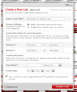
I think click “Continue” with my internal fingers crossed that I am finished, only to see another pop up panel that instructs me to title my list, set privacy setting, indicate any other names associated with the list, enter my city and state, and for a 3rd time, un-check the option for target to spam my email.
I am relieved to now see a panel that says “1 item added to wish list” showing a picture of my bike. I then click the button that says “Continue Shopping”.
Now that I’ve got this wish list I’m determined to make my time and frustration worth it, so I continue looking for bikes until I can find as least one more to add to my list for comparison later. I find a bike that looks like a possible candidate and click on the bikes picture. I am taken to the ever reliable “Quick Info” panel.
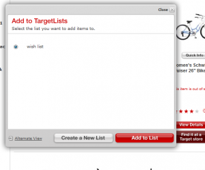
I click the “+Add to TargetList” button, hoping for a quick add to my wish list. I am disappointed to see another panel open with my only list on it, asking me to “Select the list you want to add items to”. Horribly annoyed, I click “Add to List” only to see another popup that confirms it has been added to by list. I click “Continue Shopping” and then close the browser extremely annoyed.
My Solution
One thing I’ve learned over the years, is if your going to complain about something, you’d better as least have one suggestion for improvement. We’ll I have a few.
- If I don’t click on “Quick Info”, don’t open the “Quick Info” panel. It just gets in my way and doubles my click load.
- When I click on a product picture open the product details for that picture. If I am already on the product details page, open a bigger view of the picture.
- When on the product details page, provide a clear and easy way to return to my results, so I don’t have to click the back button. If I do click the back button, take me to my last page, not the last panel that was open on the last page I was on.
- When writing this article, and re-reviewing the site, I noticed that only in the “Quick Info” panel do you have the option to see all “Images” and that this view actually has a zoom. This needs to be on the actual product page as well, not just the Quick Info panel
- Avoid jargon and be clear as to my options. TargetList is not clear, Wish List is.
- Provide a way for customers to compare products
- Only ask the question that are absolutely necessary and reduce unnecessary steps. The seven panels I had to work through to add my first wish list item were not only very annoying, but also unnecessary.
- If more than two panels are found necessary, confirm how far I am in the process, i.e. You are on step 2 of 3.
- When adding future items to my list, take advantage of good defaults, and use the only list I have created, or the list I used last, then provide the option to change lists, or add to a new list on the only possible panel that needs to open, a confirmation panel.


Can you see through TARGET’s corporate marketing strategies? TARGET purposely hides certain aspects of retail items/orderable items to provoke any shoppers’ spending, at location TARGET stores, and/or at TARGET.com. TARGET has to make annual massive revenue, and from the TARGET CEO on down to the wimpiest employee, to the TARGET electronic checkout registers, the TARGET ATM’s (even the surveillance cameras in the ceiling in all the TARGET store locations), and TARGET.com, the ploy/plot/scheme is to provoke shoppers’ interest to get shoppers to shop and spend more as much as possible at TARGET.