The Power of A/B Testing
When it comes to increasing conversions on click through and sign up, and testing the nuances of design all of my favorite articles are coincidentally about A/B testing. Below I will discuss two of those posts, one about Sidelinesapp.com and one about Highrisehq.com.
What is A/B testing?
A/B testing is a simple way to compare two or more versions of a page with slight changes to see which one attracts more attention to the area you are focusing on (higher conversions). Using a service like Optimizely you can load in the different designs you want to compare, and people who come to your website will randomly be presented with one of your versions. Their activity is tracked and then you can view a report showing the differences.
Sidelinesapp.com from 5% to 55%
Vinay Kuruvila’s talks on his Tumblr page about how they used A/B testing to increase their page conversion from 5% to 55% on Sidelinesapp.com. Some of my favorite parts of this article are in his explanation and analysis of why certain changes resulted in increased conversions.

Graphics
They started their homepage with a screen shot of their product, a pretty common design trend to help provide clarity and set expectations for the user. They even validated the screen shots with others and received positive feedback. However this converted poorly, why? Kuruvila’s analysis is:
…with certain types free consumer apps, simplicity and an eye-catching photo works much better than clearly trying to explain your product with screenshots.
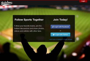
The screen shots didn’t help to clarify the product because the type of product they had leaned heavily on conversational interactions and sharing behaviors that required users to interact with it to fully get it. So they tried something different, showing a picture next to their signup instead of the product screen shot. They choose a picture that would resonate emotionally with their audience, one that would probably have been a topic of high conversation in the website, a Super Bowl photo that would be highly identifiable with the target sports audience. This improved their conversions from 5% to 17%. Next they decided to expand on the photo idea, and choose a sports photo as a large background image, placing their signup prominently in the middle of the screen with the tagline. This increased their conversions to 25%.
Content
Now that they had imagery pretty locked down it was time to focus on their text. They looked for a solution that would help identify what their value proposition was, while being succinct and vague enough to still peak curiosity. By changing text from a focus on sharing, to a focus on consuming information about sports they further improved their conversions from 25% to 40%. Kuruvila noted that most users start as consumers, then once they become more involved begin to become contributors. Therefore, this change in messaging better targeted new user signup.
Final Details
Some final changes to allow users to use their email if they weren’t comfortable with the Facebook or Twitter login, and some research on their biggest demographic groups provided the final set of changes landing them at a conversion rate of 55%.
37Signals.com
Highrise Signup Page
One of my favorite A/B articles to send around for the past few years was done by 37Signals on their headline for their Highrise signup page. They tested five different headline and subhead combinations to measure the number of conversions.
Their original design headline focused on the call to action “Start a Highrise Account” with the subhead “Pay as you go. 30-day free trial on all account. No hidden fees.” The other versions they tested all shared a very similar theme but changed the focus to emphasizing things such as testimonials, additional features, and immediacy.
The winner, put the focus on what the user gets out of it “30-day Free Trial on All Accounts” and used the subhead to emphasize the ease and quickness of the signup process and instruct on next steps “Sign-up takes less than 60 seconds. Pick a plan to get started!” This version did 30% better than their original.
Highrise Home Page
In going back to their blog Signals vs. Noise to re-read the article for this post, I found myself clicking around a bit and found that 37Signals has since posted some additional A/B testing articles on the changes to their Highrise home page with some fascinating results emerging between long form design and big photos of smiling customers.
Have a Good Example?
I would love to hear about any good articles you may have come across that I can add to my collection!
